Level Up Your Marvel Rivals Gameplay
Capture your epic wins, clutch moments, and even hilarious fails with Eklipse. Easily create and share highlight reels with your friends—even if you're not streaming!
Learn MoreCreating a visually appealing and effective YouTube banner is crucial for channel branding and audience engagement. The YouTube banner aspect ratio plays a key role in ensuring your banner looks great across all devices, from TVs to smartphones.
In this guide, we’ll cover everything you need to know about banner dimensions, safe areas, and design tips to help you stand out in 2024.

Recommended Dimensions for YouTube Banners

Understanding the correct dimensions for your YouTube banner is essential for optimal display.
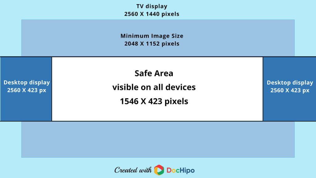
The ideal size for a YouTube banner in 2024 is 2560 x 1440 pixels, maintaining a 16:9 aspect ratio. This ensures your banner appears crisp and professional on larger screens like TVs while remaining adaptable to smaller devices like tablets and smartphones.
For creators who want to meet the minimum requirements, 2048 x 1152 pixels is the smallest dimension accepted. However, sticking to the recommended size guarantees better results. High-quality banners avoid pixelation and provide a polished first impression for your channel.
Safe Area for Text and Logos

Placing important elements in the right areas of your banner is key to ensuring your channel branding shines.
The safe area for YouTube banners is 1546 x 423 pixels. This central zone ensures that text, logos, and other critical details are not cropped out when viewed on smaller devices like smartphones.
By focusing key information within this safe area, you can maintain a professional look and make sure your branding remains intact across all devices. Overlapping into the non-safe areas might lead to your text or logos being hidden, which can disrupt the viewer’s experience.
Importance of Aspect Ratio
The 16:9 aspect ratio is the gold standard for YouTube banners. This ratio aligns with YouTube’s video thumbnails, ensuring a cohesive visual experience for your channel.
Using the correct aspect ratio prevents common issues such as letterboxing (black bars around your banner) or distorted images. A well-proportioned banner adds credibility to your channel and ensures it stands out on every screen, regardless of size or resolution.
Design Tips for an Effective YouTube Banner
Here are some pro tips to create a stunning YouTube banner:
- Simplicity is Key
Avoid overcrowding your banner with too many elements. A clean and minimalistic design enhances readability and makes a strong visual impact. - Use High-Quality Images
Always use high-resolution images to prevent pixelation. Keep your file size below 6 MB to comply with YouTube’s upload standards. - Brand Consistency
Ensure your banner matches your channel’s overall branding by using consistent colors, fonts, and imagery. A cohesive look builds trust with your audience. - Incorporate a Call to Action (CTA)
Include a subtle yet effective CTA to encourage viewers to subscribe, explore your playlists, or follow you on other platforms.
Final Thoughts
A well-designed YouTube banner can make a lasting impression on visitors and set the tone for your channel. By adhering to the YouTube banner aspect ratio, recommended dimensions, and design tips, you can create a professional and engaging banner that works seamlessly across all devices.
Investing time in crafting the perfect banner not only enhances your channel’s aesthetics but also helps attract and retain subscribers. Whether you’re a seasoned creator or just starting out, a polished banner is a critical step in building your YouTube presence.
Click here to join our Discord and win the prize!
Maximize your Black Ops 6 rewards—Create highlights from your best gameplay with with Eklipse
Eklipse help streamer improve their social media presence with AI highlights that clip your Twitch / Kick streams automatically & converts them to TikTok / Reels / Shorts
🎮 Play. Clip. Share.
You don’t need to be a streamer to create amazing gaming clips.
Let Eklipse AI auto-detect your best moments and turn them into epic highlights!
Limited free clips available. Don't miss out!
